Before
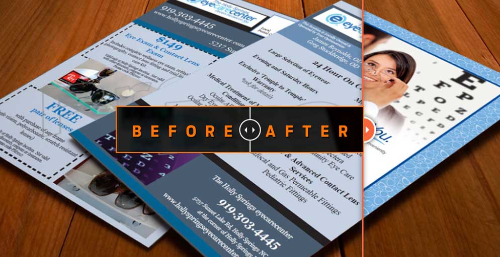
The before file was provided by the client and was a design they had received from another graphic design agency. They were not happy with the look.
After
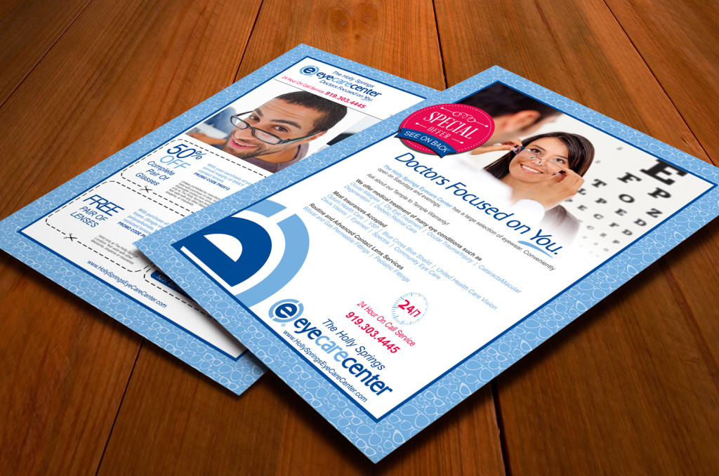
In the new design, we decided to lighten and freshen up the colors, make the focus more on the customer. Notice in the before there is a picture of the staff on the front. In our concept, we put the focus on the client. We also reinforced the Eye Care Center brand by applying the brand colors more appropriately and using the logo mark as a eye catching graphic.
