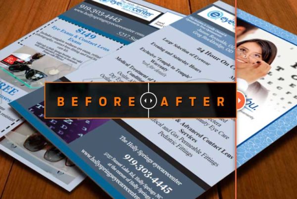

Before
As you can see on the before layout, the content is scattered and compartmentalized. The brochure lacked a unified theme and cohesiveness.
After
In the new design, we broke down the compartments to let the design breathe and open up. We unified the layout with a vivid color pallet and a strong background image. Notice on the before concept, there are many background watermarked images, or photos. Our approach was to find one strong background and let that anchor and set the tone of the entire brochure.