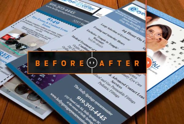
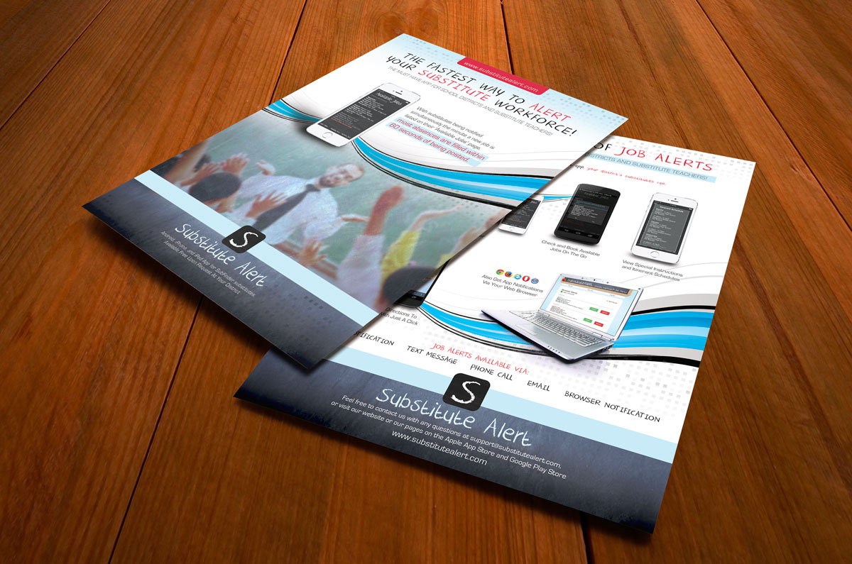
Before
It is very common that we get files from clients that have all their ideas on a page but nothing stands out. This was the case on the before image for this client. Everything on the page demands your attention because there isn’t a clear hierarchy of information. What is the reader supposed to look at first? What concept or idea should the reader understand right away? These are issues we addressed on the layout.
After
In the new design, we worked to clean up the clutter and bring in stronger images so the eye has a comfortable place to go to first, second, third, etc. Notice the strong headline at the top to immediately tell a prospect why they should be reading this. We asked the client what are the key selling points of your product and we made sure those stood out first. What problem do you solve for your clients? Do they know that right away when reading your marketing material?