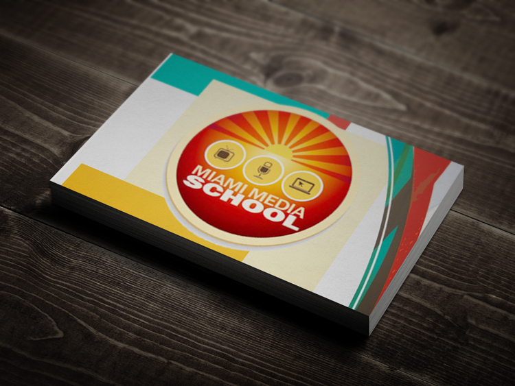
Before
The original logo has a bit too much going on in such a small space. One of the first things we noticed is when the logo is used in a small environment, such as website banner, all the details were lost. Also, notice the strongest word is SCHOOL. We felt there was a disconnect between Media and the word School. Additionally, you would want the word MEDIA to stand out more as that is a key descriptor on what type of school it is.
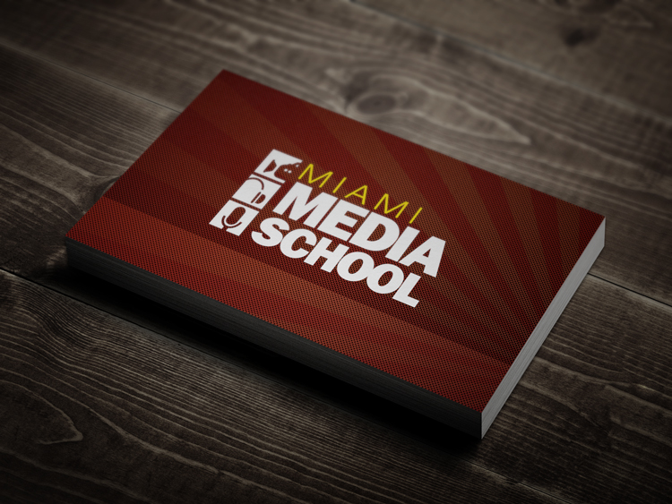
After
In the new design, we cleaned up the focus and gave it a more iconic design. This conveys strength and a timeless look. The original logo seemed a bit dated. Notice that we also put much more weight on the word MEDIA. That is the most important word but it doesn’t overpower the word School. In fact, they word nicely together. The word Miami was done in an offset color because the school had other campuses across the United States that we could swap out the location and keep the same consistent branding across all campuses.


