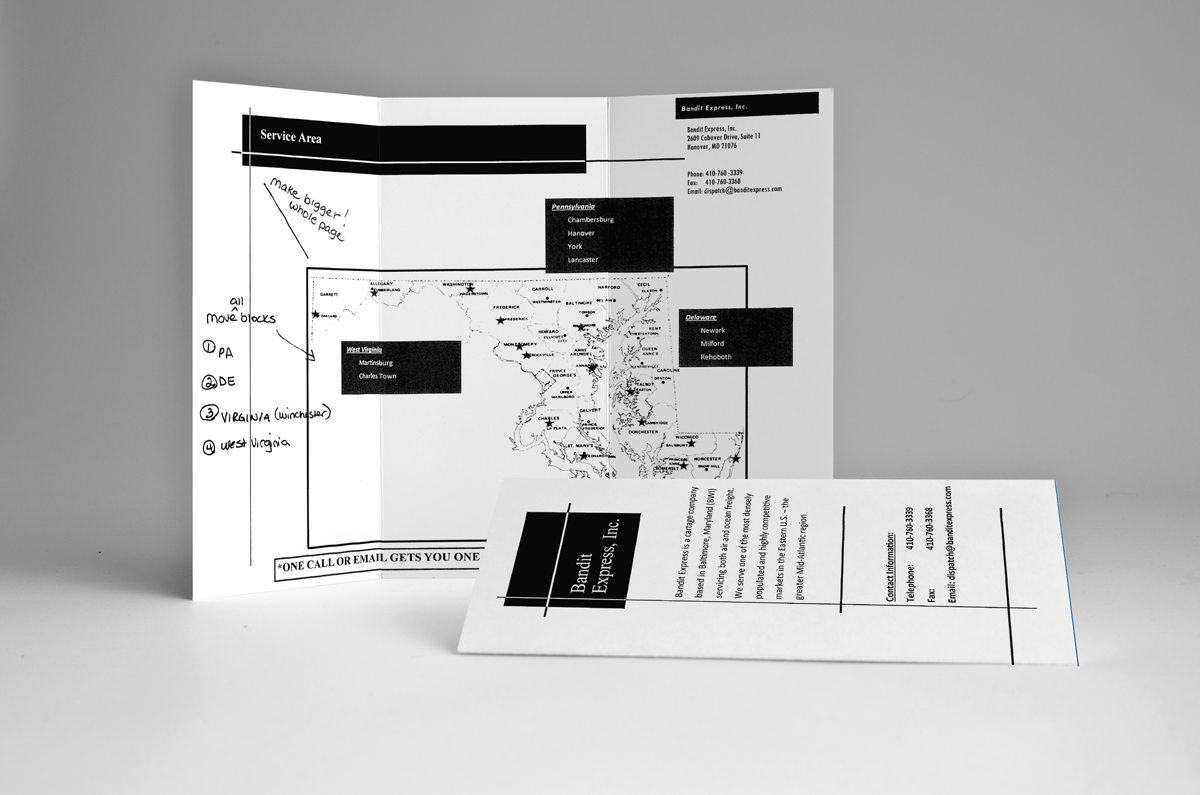
Before
The client provided us with a scanned image saved as a PDF file. They didn’t have a logo but did have some colors they used often from their website. As you can see on the before that it was likely created in Word using a basic template.
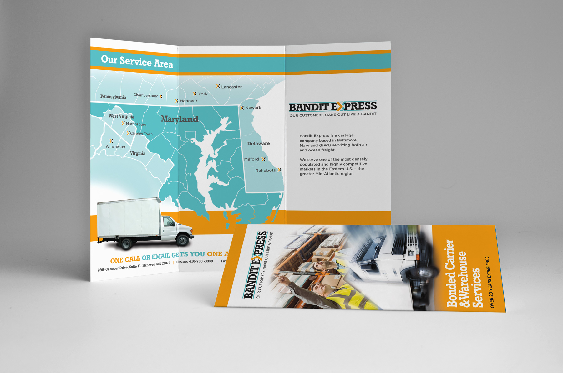
After
Adding graphics, color and proper spacing makes a world of difference. The graphics on the cover have movement and motion to represent this freight company is on the go. We even created a logo for the company to help build the foundation of a recognizable brand. They could use the new logo mark on trucks, uniforms and signage to strengthen their presence in their marketplace. We totally redid the map on the inside to make it colorful, engaging and easy to read.